Eva Heller in the book Psychology of Colours, the book which will be the foundational source for this series, opens the chapter about the color yellow stating that yellow is the most contradictory of colors and then proceeds to name 115 tones of yellow. With that amount of tones, feels just right for the color yellow to be so ambiguous. That Said, is likely that the imagery you’ll see in this post will not look similar to the picture that inspired it which portrays a close-up of yellow sand. Nevertheless, that is the picture I am using as an excuse to write about one of the primary colors (with BLUE and red the three colors that can not be obtained from mixing other colors together). Yellow in general can represent optimism but can also be the color of hypocrisy and envy. It is the color of the enlightenment but also of the traitors and despized. This ambiguity of the yellow Can be explained by its instability. The lightest of colors, yellow turns easily into green when mixed with blue and into orange when mixed with red, this characteristic helps the color yellow to assume different meanings depending on the context analyzed. The instability and lightness of the yellow are the main characteristics of the color when applied to design. Because of its lightness yellow is an attention-grabbing color but because of its instability the colors with which it is paired up matter greatily.
Yellow in fashion
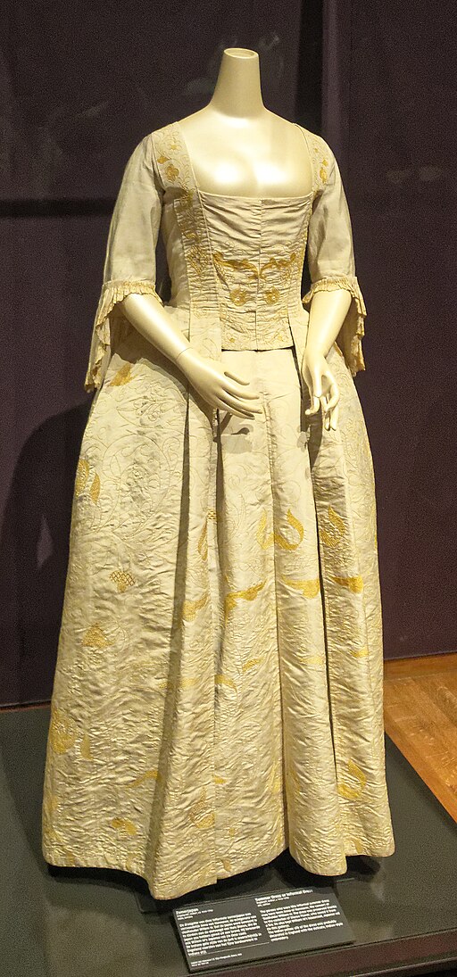
The golden era(pun intended) of yellow in fashion could be the victorian age (from 1837 to 1901 in England). The yellow was considered then the color nearest from light and used in all sorts of dresses in a variety of yellow hues ranging from gold to butter. To learn more about yellow dresses in the victorian age read this article by the awarded writer Mimi Matthews
Yellow in home decor

In interior design yellow can be used in many different ways depending on the intention of the designer. Its eye catching hability does good for decoration objects in clean spaces. For bigger furniture or paintings there are two main characteristics to justify using yellow. Yellow can bring luminosity to a room, like the picture on the right and yellow can also bring warmth to an ambient (even more if combined with the sun, like in the picture on the left).

Yellow in graphic design
Because of its lightness and instability, it’s vital to look at what colors are combined to understand yellow in graphic design. As a background for black its attention-grabbing characteristic is perfect for long-distance communication like traffic and warning signs. What makes yellow great for distance makes it unbearable for close-looking materials and makes it forbidden to use with other chromatic colors.

It is hard and very annoying to read this phrase right?
Yellow in painting
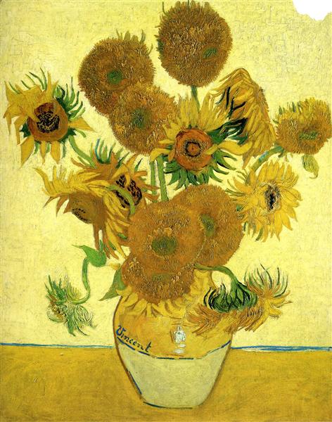
Just by reading the words “yellow” and “painting” there is a great chance that you thought of the sunflowers painted by Van Gogh, we will talk about them and the earless dutch in a bit, but first let’s talk about some other yellow pigments.
Yellow ochre
Obtained from a rock called limonite this was the first yellow pigment in human history. It is very stable and still visible in pre-historic drawings in caves. It was used throughout art history like in the Madonna di San Sisto by Rafael and is utilized even today.
Yellow orpiment
This one has a special place in history. It was used in prehistoric times and traveled around being seen in the walls of Tutankhamun’s tomb and Taj Mahal. It was also object of experiments by Romans in love with gold. Like many of the pigments in this list, orpiment was toxic and artists stopped using it by the end of the 19th century.
Naples yellow
One of the oldest synthetic pigments known. A pigment beloved by its color and better behaved than other common yellow pigments it was not stable and could even turn into black depending on the environment it was in. It was gradually being replaced by more stable pigments during the 19th century. Manet used to paint with naples yellow frequently, like in this painting
Gamboge
A yellow pigment made from a resin of the same name extracted from trees in eastern Asia. This yellow was used in China and Japan since the 8th century. It made its way to Europe from India but its use by European artists is not well documented, yet it was reported as being used in this Rembrandt work.
Lead-tin yellow
This pigment has an interesting story. It was first used in the 1300’s it was used a lot during the 15th 16th and 17th centuries, but it disappeared from art in 1750. It was a German researcher who discovered (or rediscovered) lead-tin yellow in 1940 and then the pigment made its way back into paintings. However its comeback history it is still unclear why lead-tin yellow disappeared from paintings and what happened to its recipe. Of course the work I’m using as an example of its use is from before its vanishing. It’s this Vermeer work from circa 1660.
Indian yellow
Obtained from a rock called limonite this was the first yellow pigment in human history. It is very stable and still visible in pre-historic drawings in caves. It was used throughout art history like in the Madonna di San Sisto by Rafael and is utilized even today.
Chrome yellow and Van Gogh
Van Gogh probably suffered from a mental illness, yet there is no consensus among historians about what disease it was. There are a set of Van Gogh paintings that are identified as High Yellow. Those paintings vary in location, time, and palette. It is believed though by some researchers that Van Gogh suffered from Xanthopsia, a disease that disturbs the way the eye perceives the color yellow – in Vincent’s case his episodes of the disease were probably caused by intoxication by a medicine named digitalis extracted from foxgloves. The medicine was used in the 19th century for mental inesses among others. To reinforce the hypothesis Van Gogh painted two portraits of one of his doctors in which the man holds foxgloves. If not enough, another medication taken by Van Gogh called Santonin is also known to induce xanthopsia. His probable abuse of absinthe also adds to the hypothesis that his medical conditions and addictions have played an important role in Van Gogh’s usage of yellow colors in his paintings. Aside from the reasons that made Van Gogh fall in love with yellow, his famous sunflowers and the lightbulbs in The Night cafe were both painted in chrome yellow in 1888 which made his famous sunflowers darken with time and nowadays the original paintings are closed in a dark room in Van Gogh Museum in Amsterdam in an attempt to stop the process of browning of his paintings. Chrome yellow had a bigger nd more immediate problem: it was toxic. With time and regulation chrome yellow ended up giving place to cadmium yellow once the later became cheaper
Cadmium yellow
Cadmium yellow was already available early 19th century but it was expensive and few artists could afford it, Claude Monet being one of these early adopters. Becuse it is less toxic than chrome yellow once its price fell late in the 19th century cadmium yellow replaced chrome yellow over time.
This article already is gigantic and I could keep going, but I’mcalling it.




1 comentário em “2024InColors #01 Yellow”