
To think about color is to think about light. From the perspective of physics, green occupies a unique place in the spectrum of visible light. Using the acronym ROYGBIV to memorize the order of colors by frequency and wavelength, green sits right in the middle, serving as a transitional bridge. It divides the visible spectrum into two groups: the warm colors (red, orange, yellow) and the cool ones (blue, indigo, violet). While green is not a primary color in modern theories—being a mix of blue and yellow—it held that status in ancient color theories. These older frameworks prioritized psychological and symbolic meanings over chromatic properties. Green, as the color of nature, symbolized life and renewal, making it foundational. Unlike other colors, like yellow (discussed here) that turns green when mixed with blue and orange when mixed with red, green is always green, whether darker, lighter, or browin-ish, green is green.
Green: The Color of Balance, Nature, and Renewal
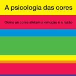
Eva Heller, in her book The Psychology of Colours (the foundational source for this blog), delves into the nuanced meanings of colors, revealing their complex and often contradictory associations. Green, the central color of nature, emerges as a symbol of growth, tranquility, and harmony, yet also conveys envy and stagnation. With over 100 shades cataloged in her work, green’s versatility is undeniable, making it both a color of peace and provocation. Green is a secondary color, achieved by mixing blue and yellow—a blend of calm and cheerfulness, stability and energy.
The imagery inspiring this exploration of green might be different for everyone: a verdant forest, a calming jade stone, or even a neon-green billboard. But no matter the visual cue, green’s meanings shift depending on its hue, saturation, and context.
Green in Nature and Its Symbolism
Green’s strongest association is with the natural world, symbolizing renewal, fertility, and balance. As the color of chlorophyll, it’s synonymous with life itself, connecting us to the cycles of growth and renewal. This connection explains why green often serves as a grounding and restorative color in design and wellness practices.
On the flip side, green can also signify decay or toxicity, as seen in the vibrant greens of poison dart frogs or the sickly pallor of mold. This duality mirrors the dichotomy of life and death in nature, reinforcing green’s layered meanings.
Green in Fashion
The popularity of green in fashion has ebbed and flowed, often linked to its production challenges. In the Victorian era, green became a fashionable yet dangerous color due to the use of arsenic-based pigments like Scheele’s Green. While it adorned the dresses and decor of the elite, it also caused severe health issues.
Today, green in fashion is celebrated for its versatility. Darker greens like forest or emerald exude elegance and stability, while brighter tones like lime or neon convey boldness and energy.
- Historical Note: The “green dress” in literary and cinematic works often symbolizes passion, jealousy, or connection to nature. Think of Keira Knightley’s iconic green gown in Atonement.
Green in Home Decor
Interior designers often use green for its calming and balancing effects. A pale sage can make a room feel peaceful, while a deep emerald adds a sense of luxury and depth.
- Warmth and Vitality: Green pairs beautifully with natural wood tones, bringing an earthy, grounded feeling to a space.
- Light and Freshness: Lighter greens, like mint or pistachio, can brighten rooms, offering a fresh and airy atmosphere.
Green’s versatility allows it to transition across styles, from minimalist modern interiors to lush, bohemian aesthetics.
Green in Graphic Design
Green in graphic design has a significant impact on branding and messaging:
- Positive Associations: Brands focusing on health, wellness, and sustainability often use green to communicate growth, vitality, and eco-consciousness.
- Neutrality in Finance: The financial sector employs green to represent stability and prosperity (a nod to its connection with money).
However, the choice of green in design requires careful consideration. For example, pairing green with too much red can evoke unintended holiday associations, while neon greens may overwhelm viewers when used excessively.
Green in Painting
Artists have long wrestled with the challenges of green pigments, from their instability to their toxicity.
- Verdigris: A bright green pigment used during the Middle Ages, derived from copper acetate, was both stunning and corrosive.
- Emerald Green: A 19th-century favorite for its vibrant hue, emerald green was notorious for its high arsenic content, leading to its eventual decline in use.
- Modern Greens: Safer synthetic pigments like phthalo(coloring “modern green”) green and chromium oxide green now dominate the artist’s palette, offering a range of tones without the health risks of their predecessors.
Green and the Masters
Many great artists used green to evoke nature and emotion:
- Claude Monet: His Impressionist works often featured lush greens to depict tranquil gardens and serene water lilies.
- Edvard Munch: Used dark, moody greens to convey angst and unease in The Scream.
Green’s Legacy in the Modern World
In the digital age, green retains its symbolism of renewal and eco-consciousness. It’s the color of recycling icons and sustainability logos, a reminder of our need to coexist with nature.
Yet, green’s versatility ensures it’s far from one-dimensional. Whether as a soothing sage in a spa, a rich emerald in high fashion, or a neon hue in a nightclub, green continues to captivate and inspire, adapting to every context it encounters.
This exploration could go on endlessly—like the cycles of growth that green embodies—but for now, I’ll let the color speak for itself.