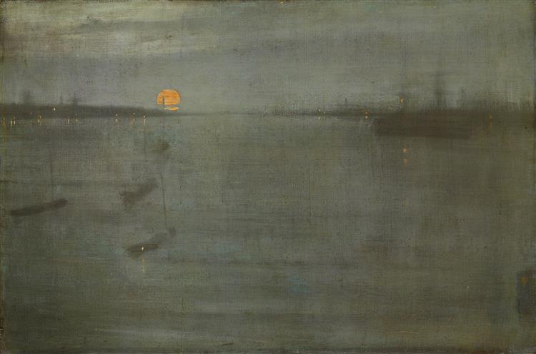
When it comes to the color gray (or grey), one of the first things that stands out is the difference in spelling between American and British English. This divergence dates back to the 18th and 19th centuries when American English, under the influence of lexicographer Noah Webster, simplified many British spellings to make them more phonetic, favoring “gray” over “grey.” Meanwhile, British English retained “grey” as the standard. Both spellings are correct and refer to the same neutral tone that lies between black and white. This subtle linguistic variation mirrors the essence of the color itself—gray is versatile, understated, and nuanced, adapting seamlessly to different contexts and interpretations.
Gray is often associated with balance and neutrality but also evokes feelings of formality, sophistication, and even melancholy. It is a color that doesn’t demand attention, making it a powerful tool in design and art where subtlety and refinement are key.
Gray in Fashion
Gray has long been a staple in fashion, where it symbolizes elegance and timelessness. During the Edwardian era, gray suits became the hallmark of refined menswear, representing formality and taste. The shade continues to dominate in modern wardrobes, especially in professional settings, where it conveys authority without the starkness of black.
From silvery metallic tones in haute couture to soft heather grays in casual wear, the color’s versatility is unmatched. Designers often use gray to create a sophisticated palette, pairing it with bold accents like red or yellow for contrast. In accessories, gray leathers for handbags and shoes have become synonymous with understated luxury.
Gray in Architecture
Gray has a unique place in architecture, where its neutral quality makes it an excellent choice for various styles and environments. In modernist architecture, gray often appears in raw materials like concrete, steel, and stone, emphasizing simplicity and functionality. Brutalism (1950’s – 1980’s), for example, relies heavily on exposed concrete, using gray to highlight the honesty of construction and materiality.
In contemporary designs, gray is used to create clean, minimalist aesthetics. Lighter grays can make spaces feel airy and expansive, while darker grays bring depth and a sense of coziness. Architects also use gray to complement natural surroundings, allowing buildings to blend harmoniously with the environment. Paired with glass and greenery, gray structures often feel timeless and grounded.
Brutalism in Florianópolis: The CEISA Center
Brutalism hits very close to me, in the city I currently live in there1ss a lot of brutalist influenced buildings including this one that Ii lived in front of for one year, so I had to write a little bit about it here:
The CEISA Center, located in the heart of the island portion of Florianópolis, is a prime example of Brutalist architecture in the city. Completed in the 1970s, this iconic structure stands out with its imposing raw concrete façade, geometric forms, and practical design. The building’s robust, utilitarian aesthetic reflects the core principles of Brutalism, emphasizing function over ornamentation.
Strategically positioned in the city’s commercial area, the CEISA Center has become a landmark for its architectural significance and historical value. Its modular structure and exposed materials not only showcase the era’s construction techniques but also create a striking contrast with the surrounding modern and colonial-style buildings.
The CEISA Center continues to embody the resilience and boldness of mid-20th-century architecture, offering a tangible connection to Florianópolis’ urban and cultural evolution.
Gray in Home Decor
In interior design, gray has become a go-to color for creating serene and sophisticated spaces. Lighter shades, such as dove gray or silver, are frequently used on walls to add lightness while maintaining a neutral backdrop. Meanwhile, darker grays like charcoal or slate bring drama and contrast, often featured in furniture or accent pieces.
The flexibility of gray lies in its ability to pair effortlessly with other colors. It can be warmed up with earthy tones like beige and taupe or cooled down with blues and greens. In industrial-style decor, gray often appears alongside exposed brick, wood, and metal, creating a modern yet rustic atmosphere.
Gray in Graphic Design
In graphic design, gray serves as a neutral foundation that lets other elements take center stage. Light grays are commonly used in backgrounds to create a clean, uncluttered look, while darker grays offer readability and contrast when paired with white text.
Brands often incorporate gray in their logos or marketing materials to convey professionalism and reliability. Tech companies, in particular, lean on gray to emphasize sleekness and modernity, with metallic gray often evoking innovation and precision.
Gray in Painting
Gray may seem like a subdued color in art, but it has played a vital role in painting throughout history. Renaissance artists, for example, often used grisaille—a technique of painting entirely in shades of gray—to create the illusion of sculpture. This method allowed for a focus on form and composition without the distraction of color.
In modern art, gray has been used to evoke mood and atmosphere. Think of the foggy, muted tones in James McNeill Whistler’s Nocturne series or the industrial grays of Giorgio de Chirico’s metaphysical works. Gray is often a background player, but its ability to amplify or subdue other colors makes it indispensable in any palette.

Modern-Day Gray: From Cool Minimalism to Warm Sophistication
Today, gray continues to dominate across fields. Its neutrality, sophistication, and ability to evoke both cool minimalism and warm elegance make it a beloved choice for designers, artists, and architects. Whether spelling it as “gray” or “grey,”


